top of page

Empower Health
Role:
UI/UX Designer + Product
Timeline:
April 2022 - December 2022
Platform:
Web App
Team:
CEO, 2 Full Stack Devs,
3 UI/UX Designers
Tags:
Product Development, User Interviews, Beta Testing,
Rapid Prototyping
🗣️ Introduction
Bias in healthcare impacts a wide range of communities, including the immigrant, elderly, female-identifying, disabled, and LGBTQ+ communities, as well as people of color. For example, 1 out of 5 women say they have had their pain dismissed by a provider, and one of out every 4 people of color say they have faced bias in care.
Empower Health is a community-oriented review app used by patients to review their healthcare providers. The goal of our platform is to eliminate bias in healthcare by empowering our community members to find healthcare providers they love and receive the quality healthcare they deserve.
PRELIMINARY PROCESS & BACKGROUND
🔎 Problem Statement
How might we create an empowering and community-centered space where patients from a broad range of healthcare experiences can leave reviews for their healthcare providers?
👥 User Personas
Our team created various user personas to understand our users' needs, experiences, and motivations, to help us design a better platform. By creating a user persona, our team wanted to ensure we were designing the product with a specific user in mind, rather than trying to appeal to a general audience. This allowed us to create a more targeted and personalized experience for their users.
Here's an example below:

⭐ So How Does the Platform Work? A Crashcourse:
(1) Sign Up & Login
To view and write reviews, users can sign up and login into the platform.


(2) Once logged in, users can:
(a) Write a Review
Users can review a healthcare provider by rating the provider on a scale of 1 to 5 for our different subfactors -- communication, professionality, thoroughness, knowledge, and empathy -- and choosing popular tags for each subfactor, providing information about the visit (i.e. wait time), and a supplemental additional written review


(b) Find A Healthcare Provider
Users can search for a healthcare provider and filter results by demographic information


👩🏻💻 My Involvement
In the early stages of my involvement with Empower Health, we were rapidly prototyping in order to get our MVP as early as possible. Specifically, I was involved in designing three main aspects of the platform. Below, I'll walk you through the design process for each feature.
FEATURE DESIGNS
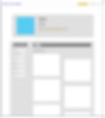
🩺 Doctor Profile Page
The Doctor Profile page is the ending page of the "Find a Doctor" flow, where after searching for a healthcare provider and filtering by demographic factors, users can view specific providers and their demographic information, insurance accepted, and office locations, as well as reviews of the selected provider. Since this was a completely new page to be designed, I was given a blank slate.
The "Find a Doctor" flow is below:

I. Setting the Right Design Goals
Since this was the first iteration of this page, I made sure to have consistent feedback from the CEO, CTO, and other designers to make sure that not only the informational requirements were met for the page, but also it fit the design elements of our other pages and was in the scope of our developers' abilities given the time constraint to launch the MVP.
Here are the main goals that guided my designs:
1) Readability
Display all the gathered data, information, and reviews in a digestible and easily readable way. This includes:
-
Office location
-
Demographic Information (i.e. gender, languages spoken, ethnicity, etc.)
-
Average Wait Time
-
Filter Reviews Menu
-
5 Subfactor Ratings + Top Selected Strengths and Weaknesses
-
Overall Ratings
-
Additional Written Reviews
2) Navigation
Not only making the information for the provider readable but also ensuring that users can quickly find the information and functions they are looking for (i.e. written reviews, subfactor ratings).
3) Accessibility
To decrease the white space and involve containers and more colors to make the information less overwhelming on the page, I tested the colors I added with the font colors and sizes to ensure they met accessibility standards.
4) Visual Appeal
Ensuring the page used colors, fonts, and other design elements in a way that is aesthetically pleasing and consistent with the brand.
II. Planning, Planning, Planning
Before jumping in, I worked with the product team to further specify the scope of the page, as well as design placement.
1) Hierarchy of Information
Because this was an information-dense page, I worked with the product team and took inspiration from popular review platforms such as Yelp to create a hierarchy for displaying the information.

2) Low Fidelity Wireframes
After determining the hierarchy for information, I created some low fidelity wireframes on Figma to visualize both the size, shape, and other design elements as well as placement for the three sections of the page: a) Doctor Name + About, b) Subfactor Ratings, and c) Additional Written Reviews.

II. Iterate, Iterate, Iterate (no pun intended)
Because we were rapid prototyping to launch an MVP, I made sure to get quick and consistent feedback throughout the high-fidelity wireframe design process. While I won't show you all 15 iterations, I'll show you an earlier iteration and the final MVP design.
1) Earlier Iteration + Feedback

2) The Big Reveal: Final MVP Design + Features

📝 Redesigning the Write a Review Page
The “Write a Review” page is a three part process where users can leave reviews for their healthcare providers.
1) Subfactor Ratings
In the first section, users can provide a rating on a scale from 1 to 5 for each subfactor category – communication, thoroughness, professionalism, knowledge, and empathy — as well as tag some common strengths and weaknesses for each subfactor.
2) Office Information
Next, users can answer questions about the provider’s office, such as wait time.
3) Additional Comments
Lastly, users can provide a written comment to contextualize their experiences in the additional comments section, and have the option to make the review anonymous.
After our beta testing sessions, I redesigned the page to address the common pain points conveyed.
I. Reviewing User Feedback
The product team completed 15+ beta testing sessions. After, we worked as a team to categorize the main pain points for each aspect of our platorm.

Below is the common feedback received for the "Write A Review" flow:

II. Goal Setting!
Based on the feedback received, I devised two main goals for the redesign of the page:
1) Reduce the amount of white space
While we want to create a space that sets the tone where more serious healthcare experiences can be shared, community members were deterred from sharing such stories, as the form seemed “too corporate” and “too sterile” with no warmness or human touch
2) Make the page more digestible and readable
We want to make the form comprehensive, but also digestible for our community members to share their experiences to their best extent. This also includes improving the user experience with minor tweaks, such as clarifying anonymity.
III. Redesign Reveal
About the Redesign:
1) A Warmer Header
"Welcome to Write a Review" creates a more friendly and empowering atmosphere
2) Rounded Edges and Containers
This style matches other pages and makes longer sections more digestible
3) More Purple!
Use of purple color gradient and vector art reduces white space and makes page more friendly
4) Anonymous Clarified
Edited copy to clarify that anonymous review is the default
Here is the redesign, compared side by side with the older version:

🪄 Redesigning the Review Submission Page
This was the page that users landed on after submitting a review. Previously, there was text confirming the review was submitted.
I. User Feedback
From our beta testing user interviews, we saw that users had 2 pain points when landing on this page:
1) No Further Action Item
Users often got confused about what they should do next after writing a review, as there were no suggestions on what to do next after submitting a review
1) Not Affirming Enough
Healthcare experiences can be tough to share! A user taking the time to write about a difficult experience and submit it, only to be faced with a page with lots of white space and little text can be un-affirming.

II. Goals for the Redesign
-
Add meaningful interactions to the submission page that are empowering and community-building
-
Create a strong and affirming atmosphere from the submissions page
III. Redesign Reveal
1) More Colorful Elements!
Vector art and use of more purple creates a more welcoming and community-focused atmosphere
2) Share Links + Social Media
I added share links and social media options so users can empower others to share their own healthcare experiences.
![Updated Submission [FINAL].png](https://static.wixstatic.com/media/a1bbeb_869db8c47fdd47d08e9b173478143009~mv2.png/v1/fill/w_66,h_47,al_c,q_85,usm_0.66_1.00_0.01,blur_2,enc_auto/Updated%20Submission%20%5BFINAL%5D.png)

LOOKING FORWARD
📊 Measuring Outputs
While our platform is developed and launched (empower-health.us), most of the design aspects above are still in development! After shipping the new features, we would ideally do more user-interviews and compare the data analytics to see how we can even further improve the platform.
💌 Personal Reflection
Empower Health has been the most challenging yet rewarding project that I’ve worked on so far!
As someone extremely passionate about Empower Health’s mission and the intersection between digital health and improving patient care, it was amazing to design such comprehensive experiences and pages from a blank canvas. Design is also such an iterative process, and I’m grateful for my team on all of the constructive back and forth feedback, redesigns, and tweaks – I owe it to them for making me the designer I am today.
Aneri, Connor, Elisa, and Deya, thank you for your leadership, mentorship, and friendship! Looking forward to more fun work sessions at Startup UCLA, potlucks, and LA adventures!
bottom of page